Designing an Actor's Site for Deborah Cortez
About this project:
Client: Deborah Cortez
Type: New Design
URL: deborahcortez.com
Squarespace Template: Carson
Started: July 2020
Completed: July 2020
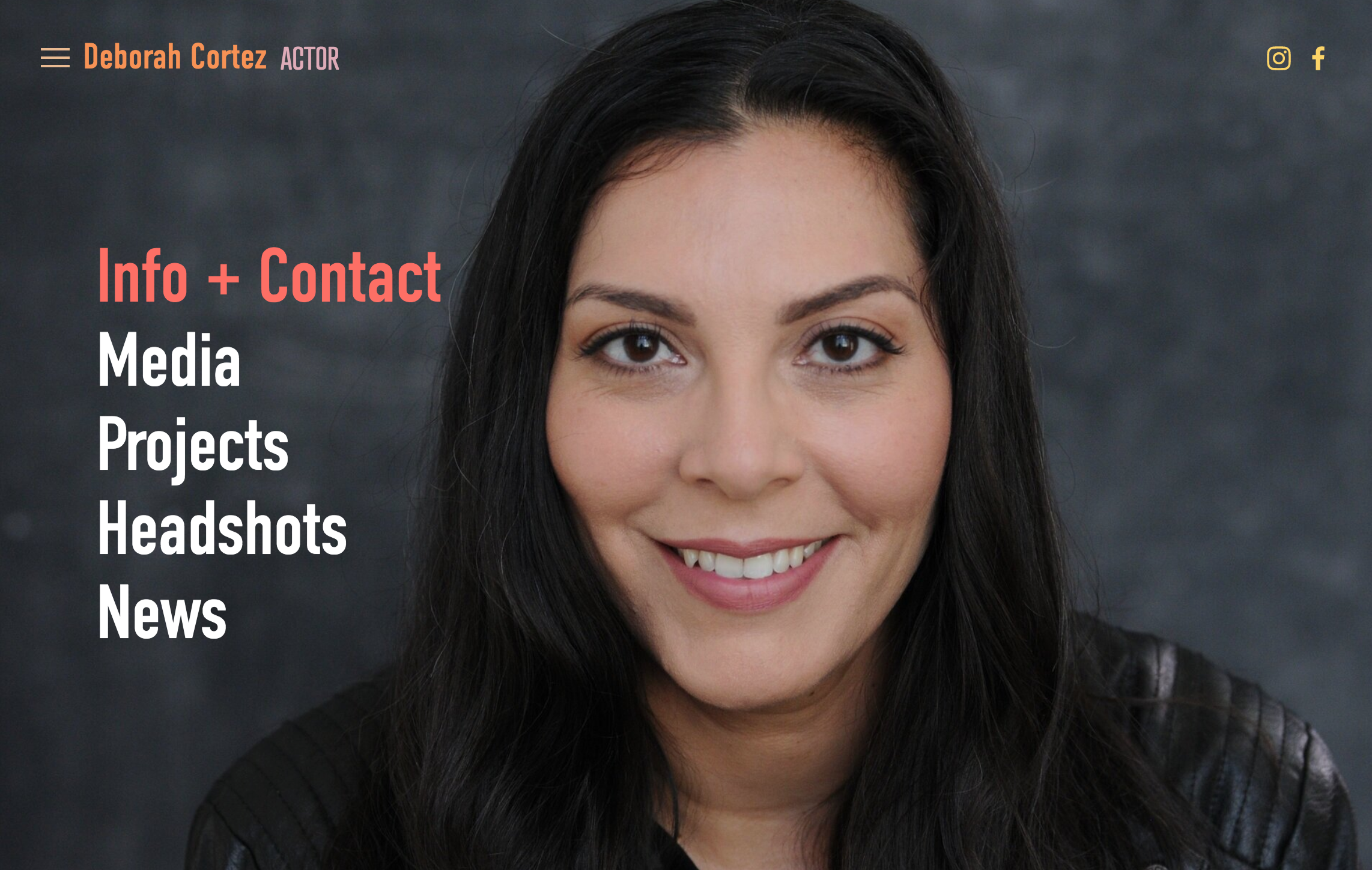
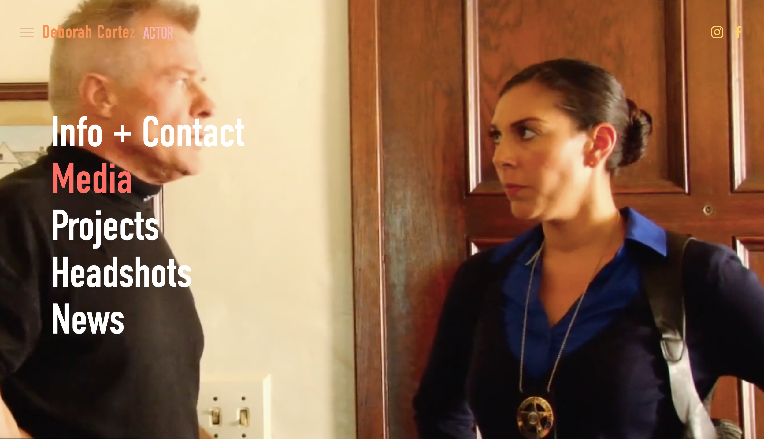
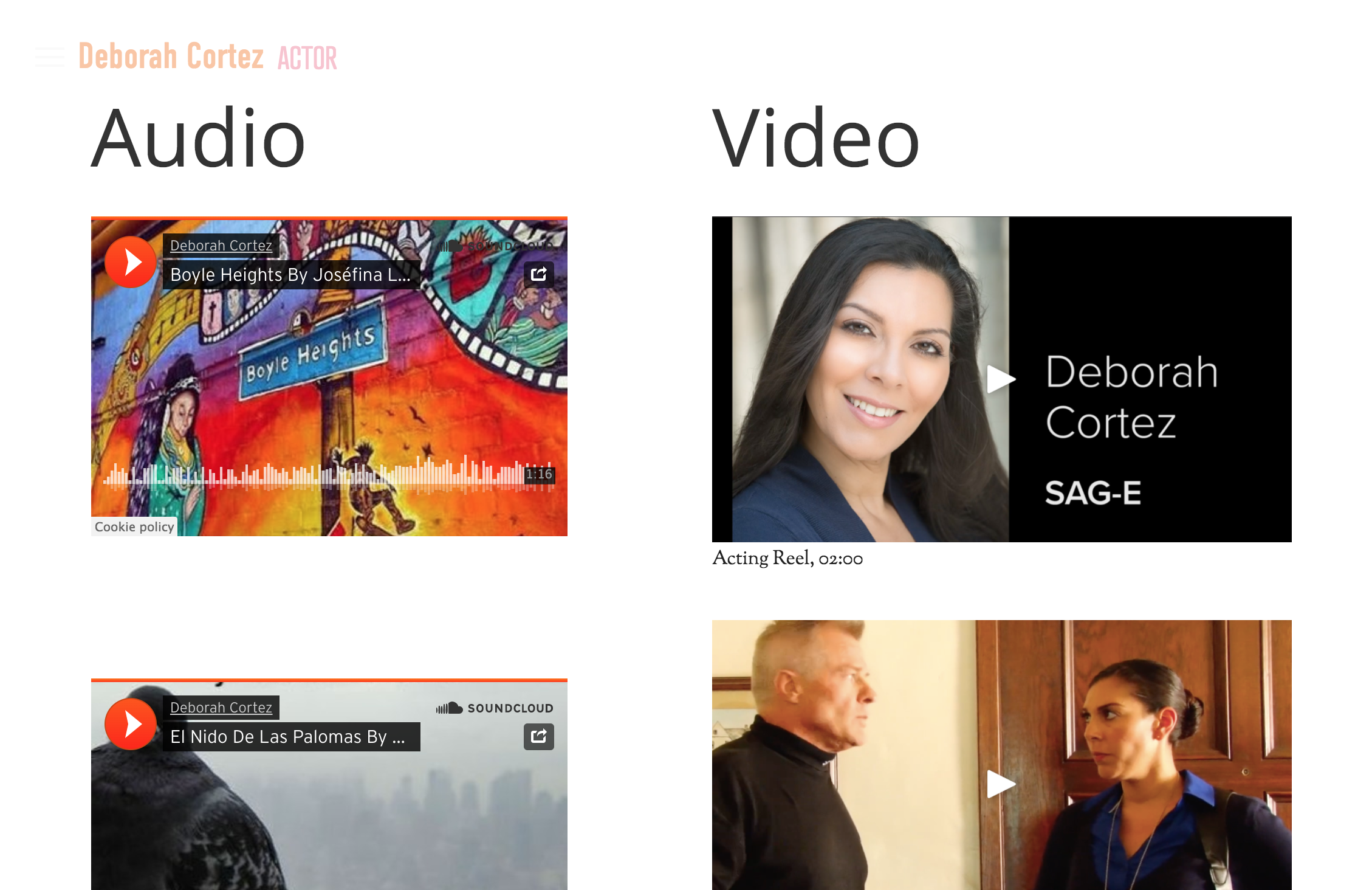
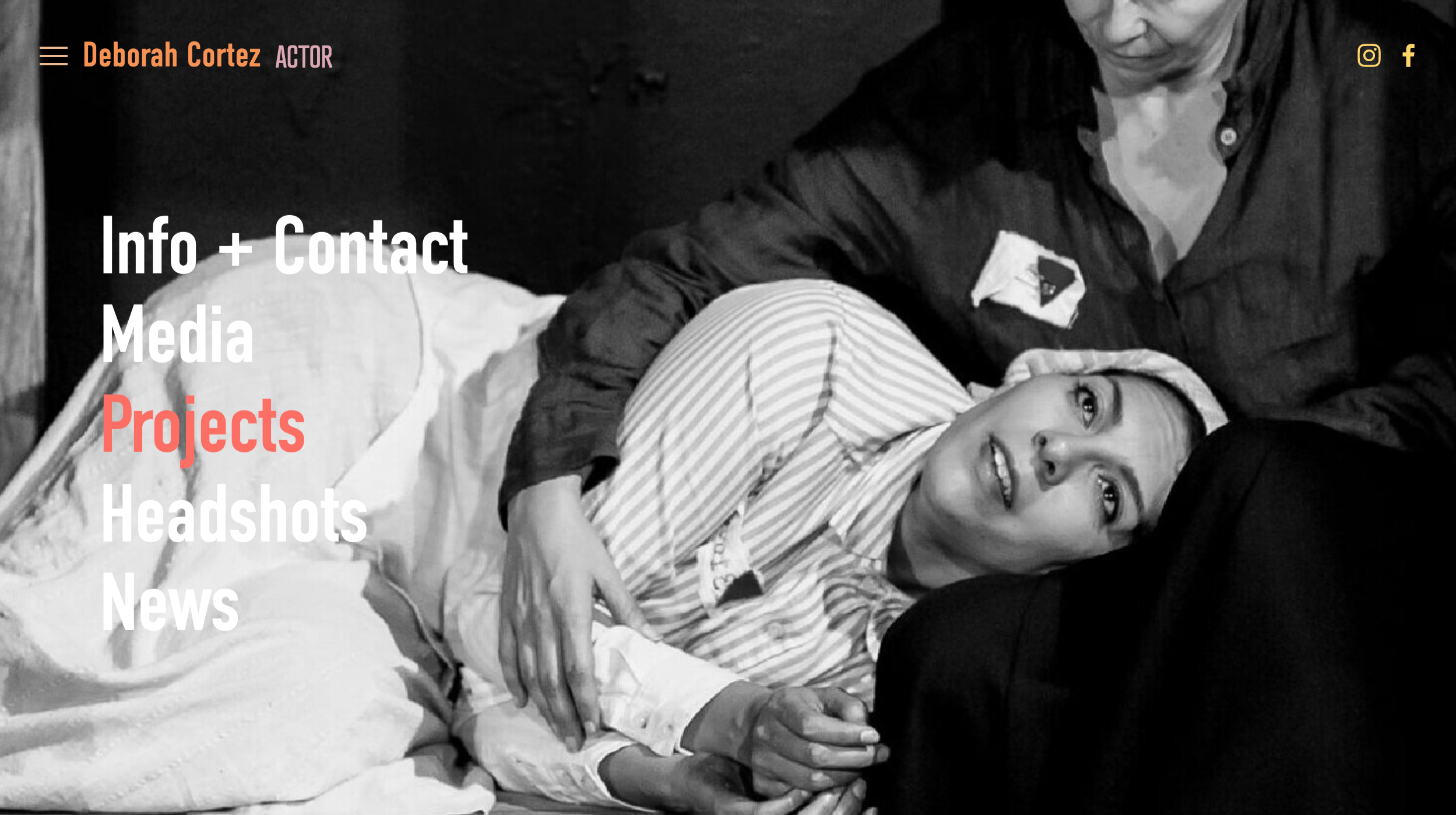
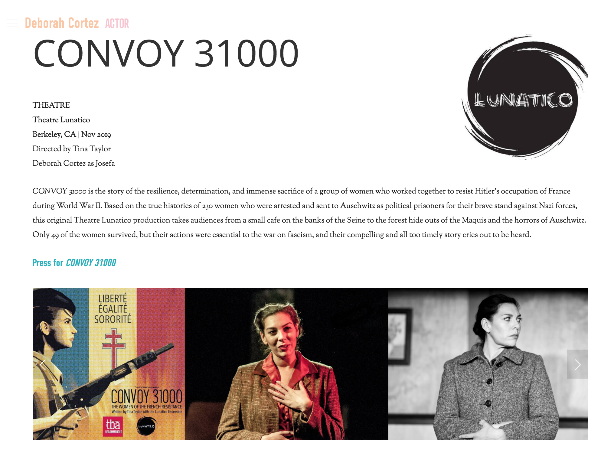

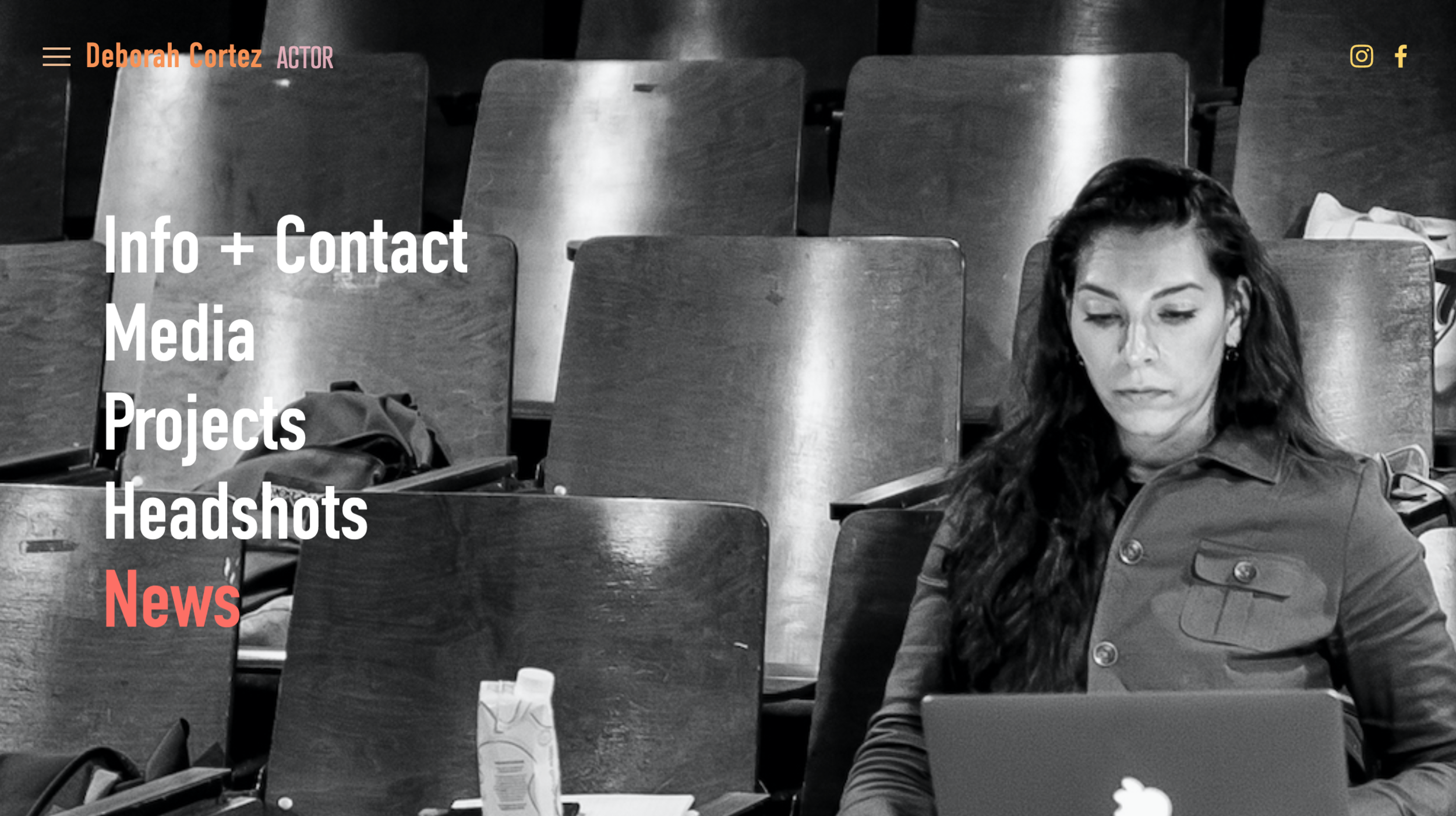
The keywords for this design are positive, energetic, and professional.
“I love pastel colors, colors that are easy on the eye and that communicate positivity and energy while keeping professional. ”
Deborah is an up-and-coming actor, singer, director, and producer based in the Bay Area who has established herself regionally, and seeks to expand into a larger media market (specifically, Los Angeles). She came to me to “level-up” her web presence with a website that would appeal to talent agents and casting directors.
We used a warm, modern color palette, and selected a template with movement, that features full-bleed images of Deborah on- and offstage. The tone is minimalist, yet energetic and personal. You get a feeling for who Deborah is, without being bombarded with anything unnecessary.
Lean, clean content is a pleasure to view.
To make it easily navigable for busy visitors, we went with a classic 5-page site:
*The News page Deborah added on her own, after I trained her to make her own updates. In it, she shares this wonderful Theatre Bay Area feature on her and her work. I think it looks great!
I love this image Deborah added for her News page!
“I understand casting directors and talent agents do not have the time to click around someone’s website, so I want to make it easy and friendly for them to use.”
Organization is key.
We completed Deborah’s site in a few weeks, and it was one of the easiest and most pleasurable collaborations I’ve done so far. In part, this was due to the fact that Deborah came ready with high-quality, professional photographs (the quality of your images will make or break a website), and that she is extremely organized.
Deborah came to our meetings ready with:
an edited bio, mission, and values statement for her About page
edited Media content pre-loaded on YouTube and Soundcloud
brief project descriptions, and current links/PDFs of press coverage for each of the works in her theatrical Portfolio
photographer credits for her beautiful Headshots
Together, we created a website that is at once functional and beautiful—and that’s really what you want with any site!
“From our initial call, I felt like you understood fully what I wanted to achieve. You heard my thoughts and vision and delivered 100%! You picked up on keywords that I didn’t even know I was using to explain how I wanted my site to be.
Having this site has helped me be more confident in my career. I ordered new business cards with a QR code to my website on the back of them and can’t wait to start building relationships in the industry using the proper tools needed to do that. I’m getting ready to submit to talent agencies both in the Bay Area and LA and I can not be more proud of my tools to share with them.”


