Designing the Remy Charlip Archive
About this project:
Client: Seth Eisen & The Remy Charlip Estate
Type: New Design
URL: remycharlipestate.org
Squarespace Template: Jasper
Started: May 2017
Completed: July 2017
For me, different factors lead to a great design on any given project. The Remy Charlip Estate online archive was successful because Remy’s work is beautiful, well photographed, and looks great on the screen. I have a wonderful working relationship with the client, artist Seth Eisen, whose own site I had previously designed, so we saw eye to eye on aesthetics and quickly developed a system to collaborate remotely on the content.
“Remy Charlip was my teacher when I was a student at Naropa University in Boulder, Colorado in 1990. He was the first well known gay artist I knew who was out and very much interdisciplinary in his approach to his work. I related to his aesthetic and was impressed with how accomplished he was as a choreographer, designer and visual artist as well as an author and artist of many children’s books. I looked up to him as a mentor and he invited me to contact him when I moved to San Francisco a few years later. We became close friends, later I became a caregiver to him and had the great honor of assembling and organizing his archive and art collection.”
The first challenge was to create a structure to showcase the different mediums in which Remy produced a lifetime of work, including Children’s Literature, Dance, and “Air Mail Dances,” an innovation that drew on his skills as a choreographer and a visual artist.
Like Remy, many artists work in different realms, simultaneously or over the course of a career. Some examples I’ve encountered:
original works, collaborations, and commissions
long-term, iterative or touring projects vs. “one-off” gigs
live performance vs. performance for camera
A body of artistic work, plus publications, teaching, and/or services
It’s important to get clear about the relative importance of the different categories of work the artist produces. Do they want one medium to have more weight than another? Are all these categories equally important, or is there one type of work they are (or want to be) best known for?
The “shape” of an artist’s body of work, as well as the different forms the work takes, call for different website structures. This is where I can help an artist get clear about how they want their website to work for them and translate that into design.
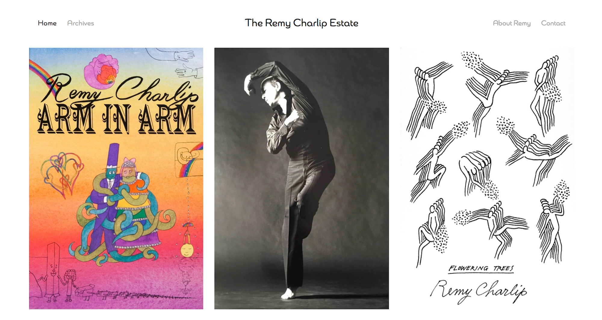
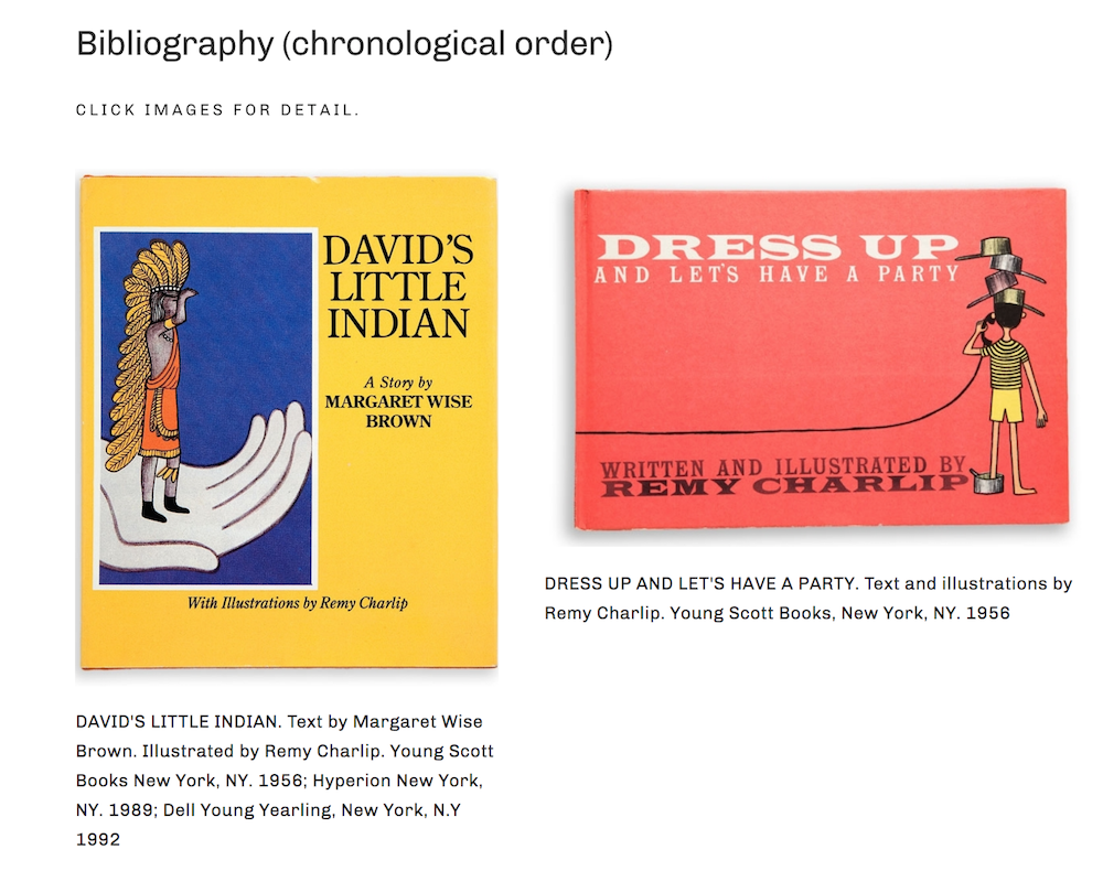
In this case, we wanted to give equal weight to the three kinds of work Remy produced. We settled on a homepage with three “panes” that click through to three different portfolios: Books, Dance, and Air Mail Dances.
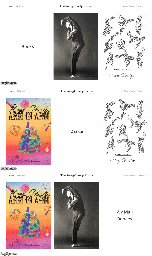
On the Home page, the title of each content collection is revealed as you mouse over its cover image. (Note: the site does NOT auto-animate like in the GIF.)
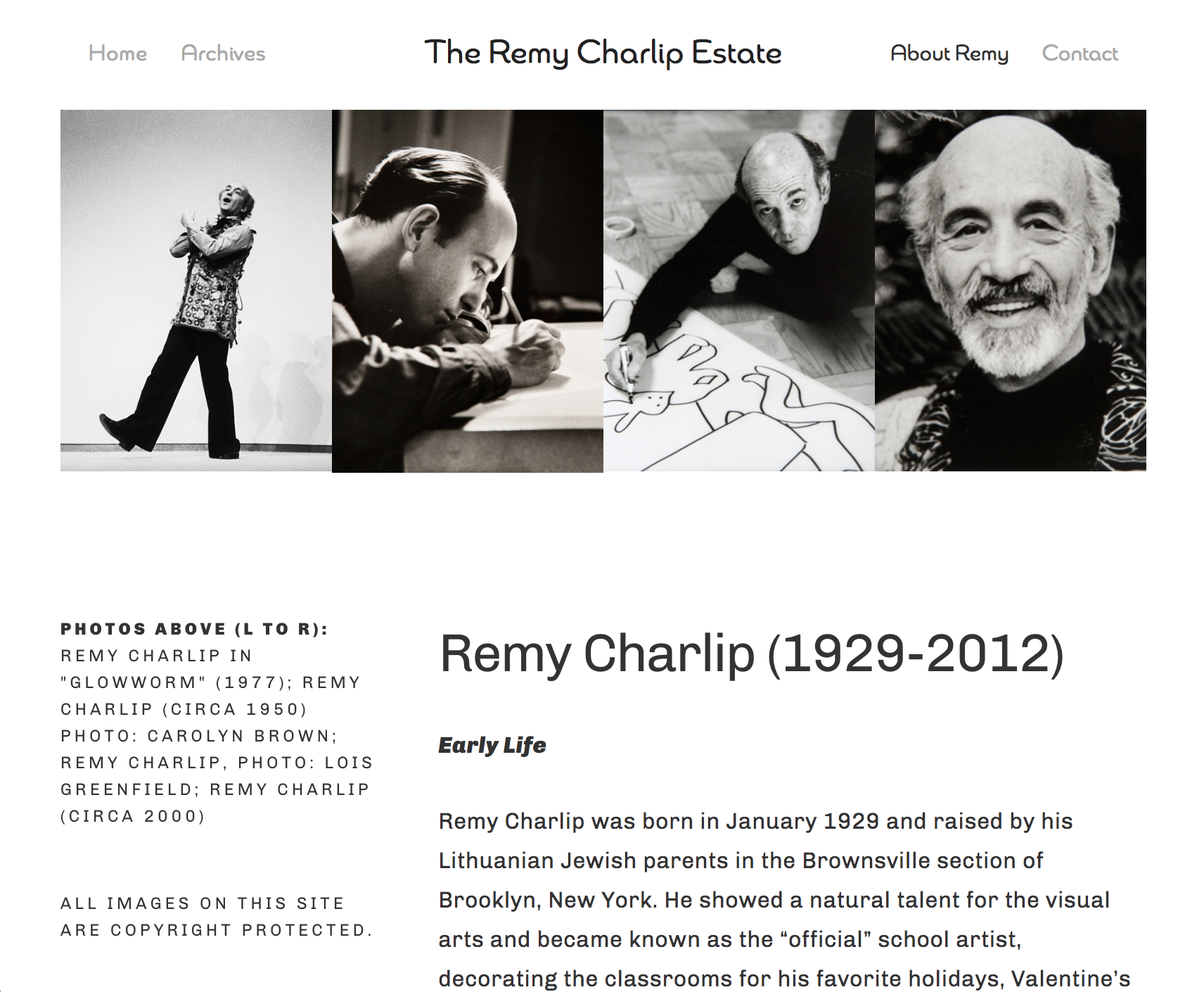
The main part of the site followed a familiar structure: Home page (which clicks through to the three portfolios), an About page, and a simple Contact page. Pretty much your typical artist’s site.
The next challenge, however, was really the impetus for the project to begin with: Remy’s Archive.
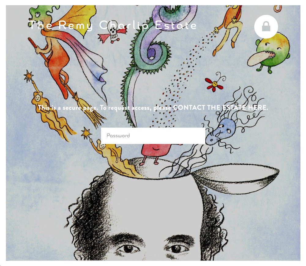
“The goal of creating the site was twofold. First, to revise and update Remy’s public presence after his passing in 2012 and, second, to make an online sampling of his archive for collectors, museums and arts institutions interested in acquiring or researching his artwork and archives. One part of the site is public and one part is password protected and only viewable upon request.
The project was easier than I thought, thanks to Allison’s expertise in organizing a massive amount of text, images and information. She made it fun and creative despite the many challenges I faced trying to represent a 60 year career with a limited budget. Allison helped me get clear on my goals and together we planned the double site carefully.”
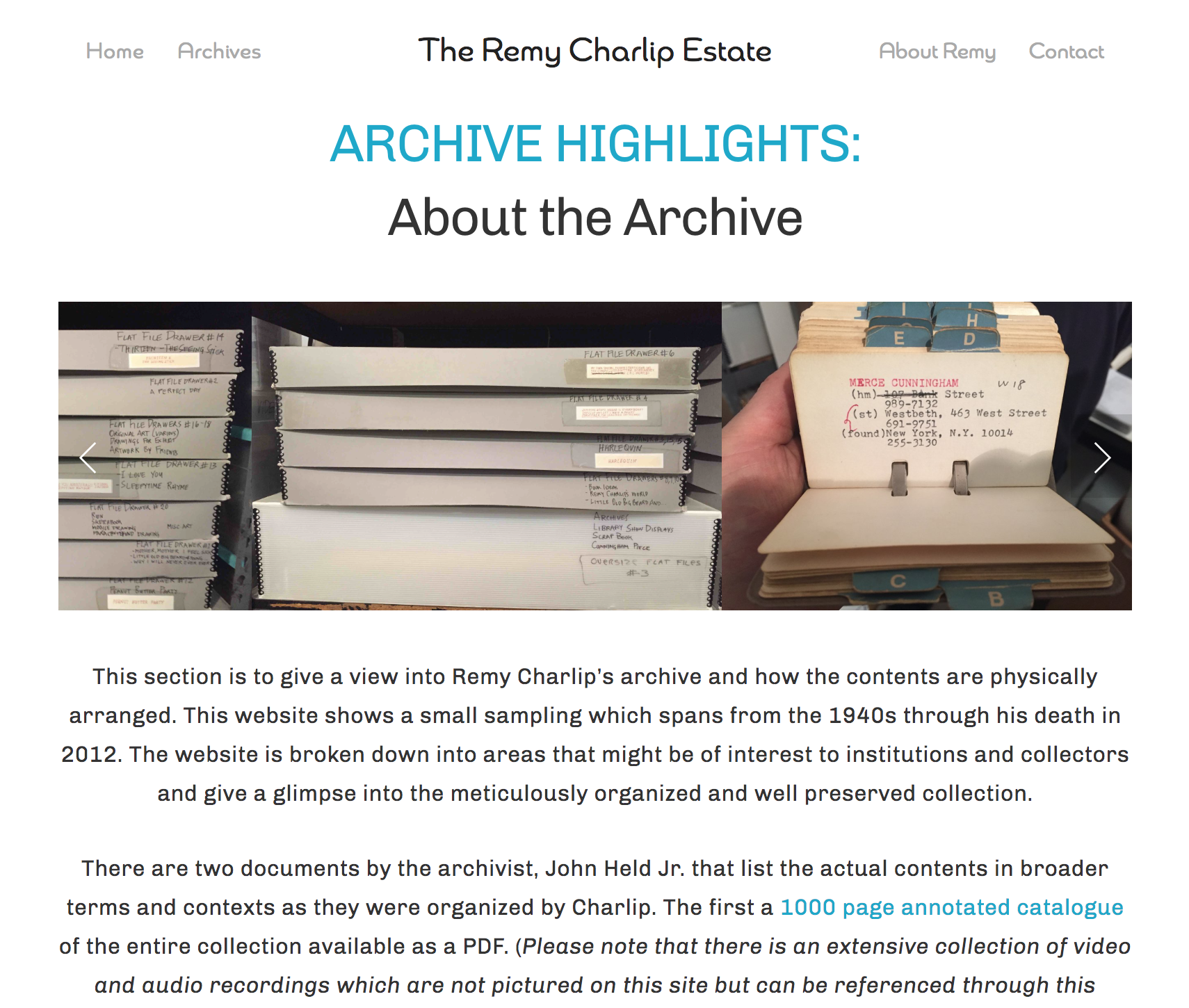
Where the public part of the site focused on three main bodies of work (Books, Dances, Air Mail Dances), the Archive additionally includes Costume & Set Design and Works on Paper, as well as personal ephemera like photos, letters, and journals, all of which had to be photographed and watermarked. Seth and I created a system for organizing and cataloguing the image assets online.
The Archive page is similar to the Home page, only with more collections of work to explore.
“There were many levels to work on in preparation. I had to photograph the work, write new text and do research to get dates and details correct. Allison made it easy and systematic so I could plug info into a shared document creating a really easy collaborative methodology. She took the sting out of managing the massive number of files, versions and coded images. She helped me edit and refine. This allowed the result to be lean and uncluttered thanks to her great instincts and design skills.”
We ended up with a site that is deceptively simple, and actually packs a lot of content. It’s elegant, approachable and informative. You can spend a long time appreciating each of Remy’s works, or you can easily get an overview of an artist’s 60 year career.
I’m proud to have played a part in preserving and sharing Remy’s legacy with the world.
“Having the site has really helped me and the executors of the estate achieve our goal of making Remy’s legacy more visible, to make it easier for people to get in touch with us, and to make the collection more attractive and visible to institutions who have an interest in it.
I feel a real sense of trust with Allison. And this was my second site with her. She is good at creating timelines, goals and limitations to focus the work and keep it on track. I feel confidant that we created the best possible design that will last for many years to come and I recommend her work regularly.
Creating a website is an intimate experience. You want to get it right. I really wanted to get this right because I wanted to do the best job I could representing my mentor, teacher and friend. Working with Allison gave me the confidence to ask the hard questions and approach the work with a critical eye but also with a positive and creative approach. You’ll see what I mean if you get to work with her.”
Explore this site at remycharlipestate.org →
For my design portfolio, pricing, and how I work, click here →
Banner image: Remy Charlip in "Glowworm" (1977); Remy Charlip (circa 1950) photo: Carolyn Brown; Remy Charlip, photo: Lois Greenfield; Remy Charlip (circa 2000). Courtesy of The Remy Charlip Estate.
