Voice, Values & Design
About this project:
Client: Michael Morgan
Type: New Design
URL: michaelmorgan.online
Template: Squarespace 7.1 fully customizable template
Started: December 2020
Completed: February 2021
The goal of this design is to generate new projects & relationships.
“Allison provided sensitive and expert support in designing and building the site. The project was helpful in fleshing out the concepts and intention of my work.”
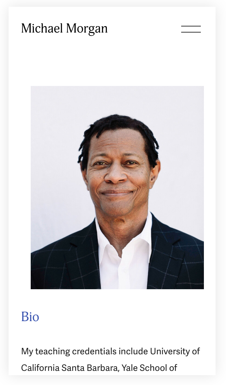
Michael Morgan is an actor, director, professor, and acting and voice coach whose passion is helping marginalized communities find their voice through theater and performance.
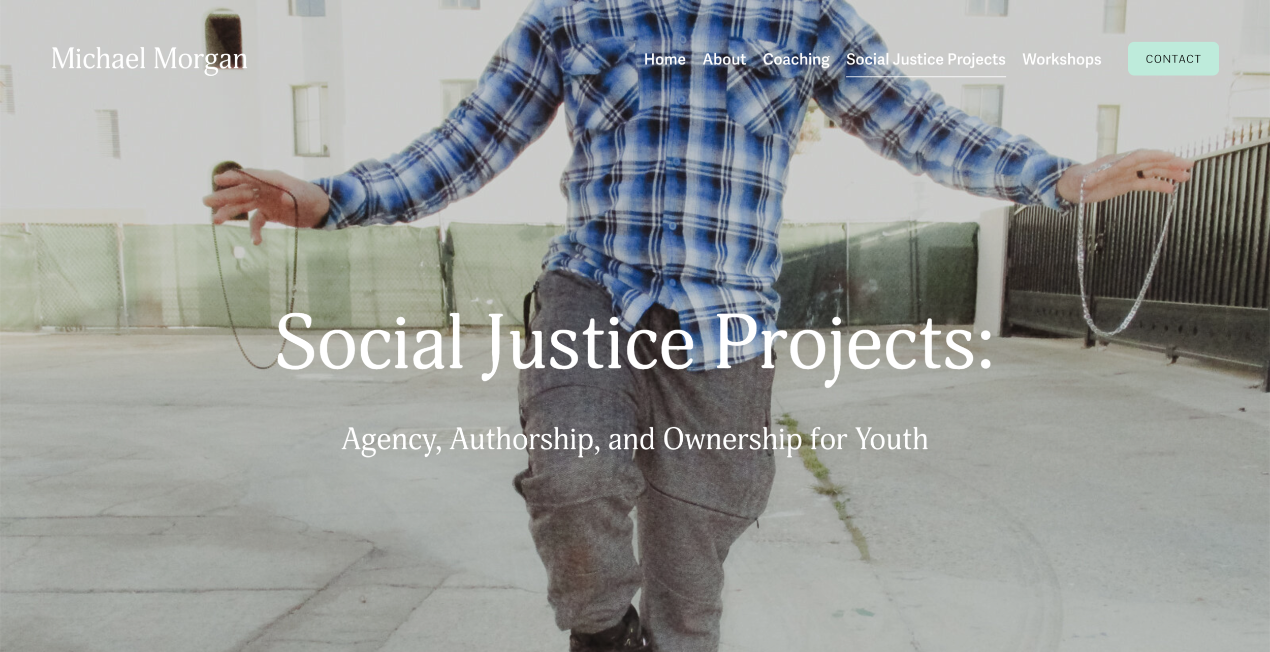
Practically speaking, his new website needed to attract new clients and collaborators, and showcase his portfolio of social justice projects. But it also needed to make a statement about who Michael is, and what he stands for.
Why it works.
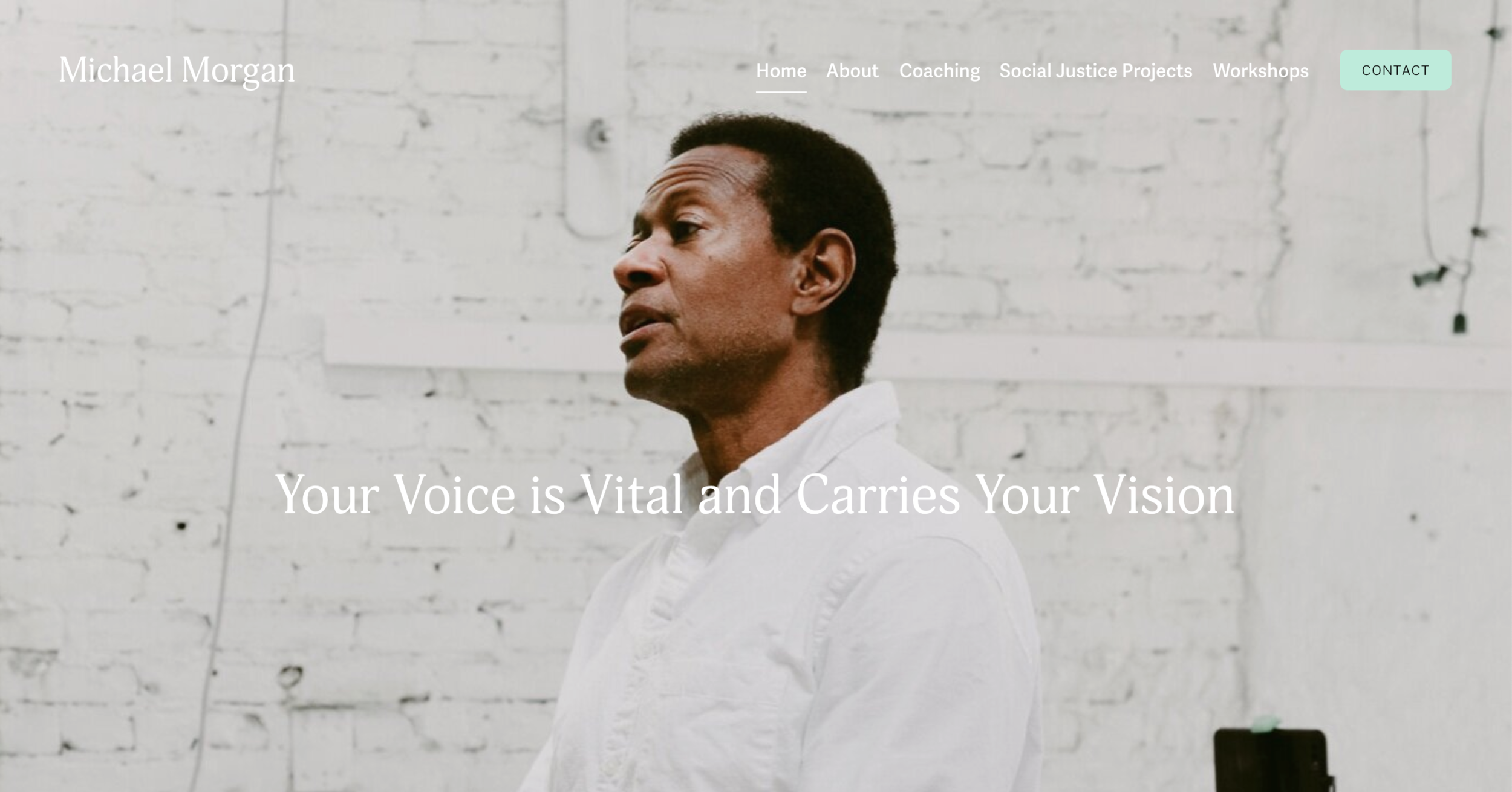
Michael’s home page features well-defined vision & mission statements, a list of three service offerings with clear calls-to-action (“Learn More” buttons, about and contact links), and images of himself at work in the studio and in the world.
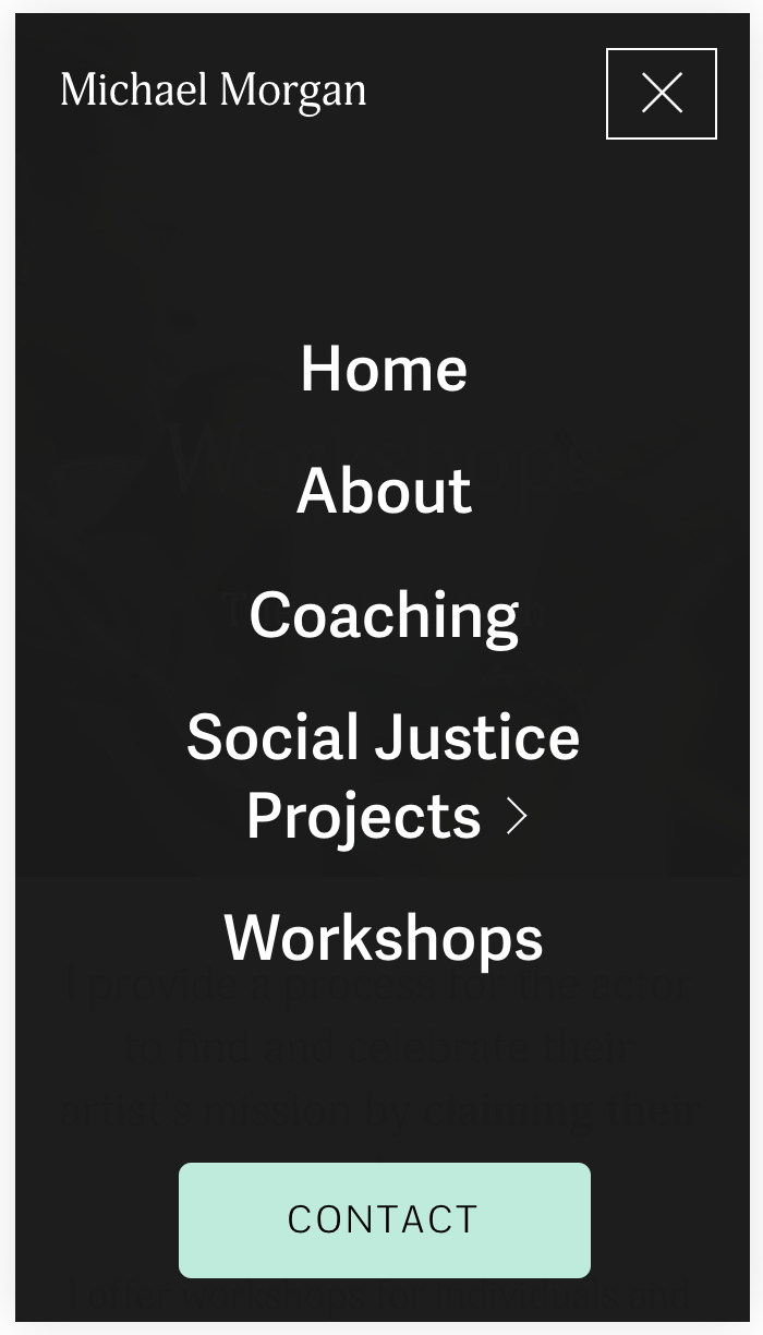
Note the prominent contact button in the main navigation at the top, inviting visitors to get in touch before they leave the site.
Images speak.
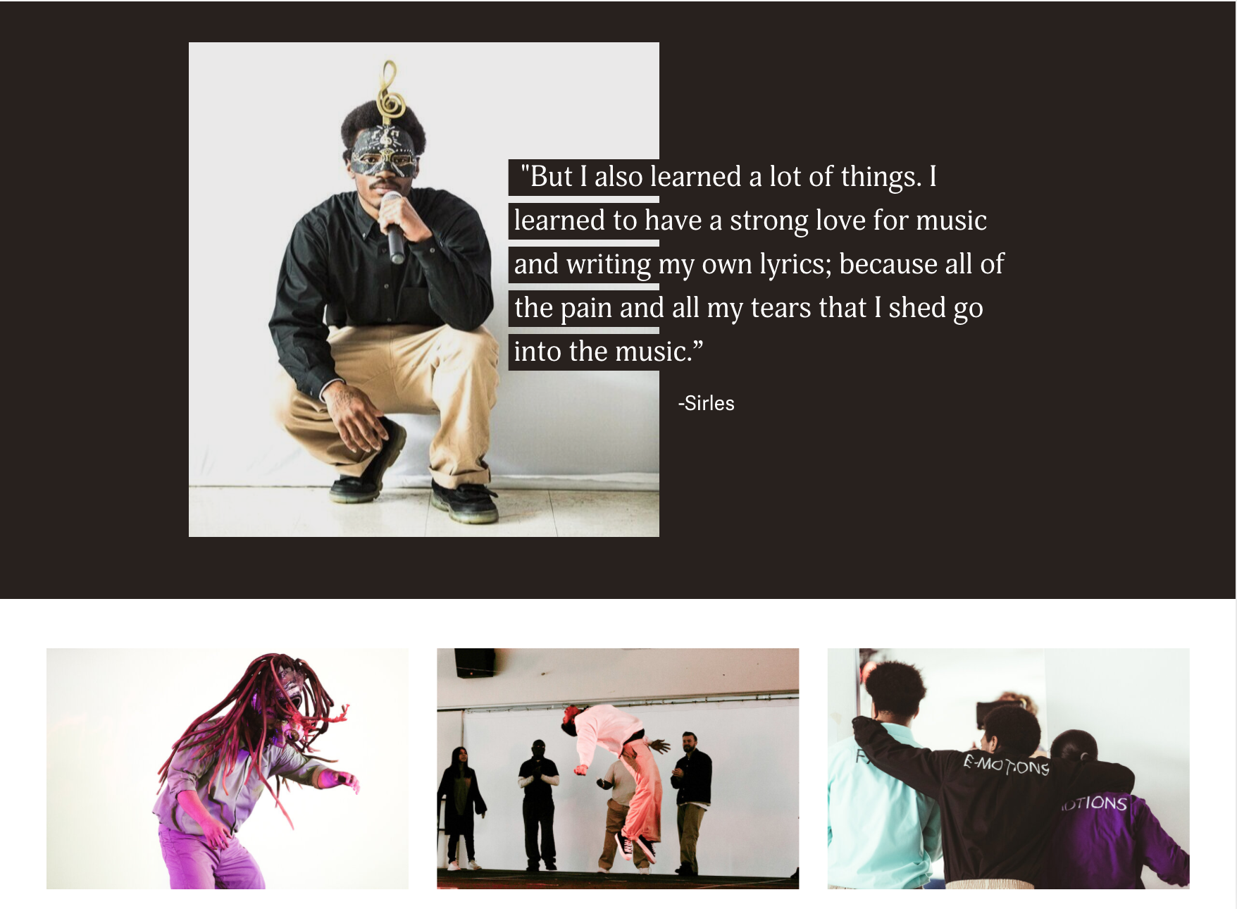
A big part of Michael’s work with marginalized youth is helping them find their voice to tell their story. On project pages, we collaged images of the performers with their words to illustrate this.
Images and a quote from The Odyssey Project, a social justice project directed by Michael Morgan. (click to expand)
Don’t let a lack of documentation stop you from creating an important page.
While Michael didn’t have images of himself coaching his voice clients on African and African Diaspora accents, a stock photo of the Serengeti creates an inspiring mood that fits the purpose nicely.
Layout can help clarify content.
A lot of my clients are artists who also work in academia. Understandably, they tend to write about their work for academic audiences. But academic language isn’t always right for your website, if you want to connect with a variety of visitors.
Layout can help break up long essays into key thoughts and phrases, making project statements easier to digest online. For inspiration, I use magazine layout as a guide, pulling out main ideas in a header font, using white space for rhythm and to break up chunks of text, and bolding key phrases within paragraphs.
